Content
Showing the work, not just telling
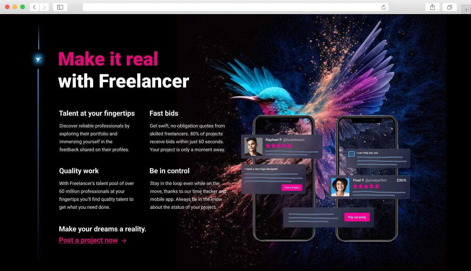
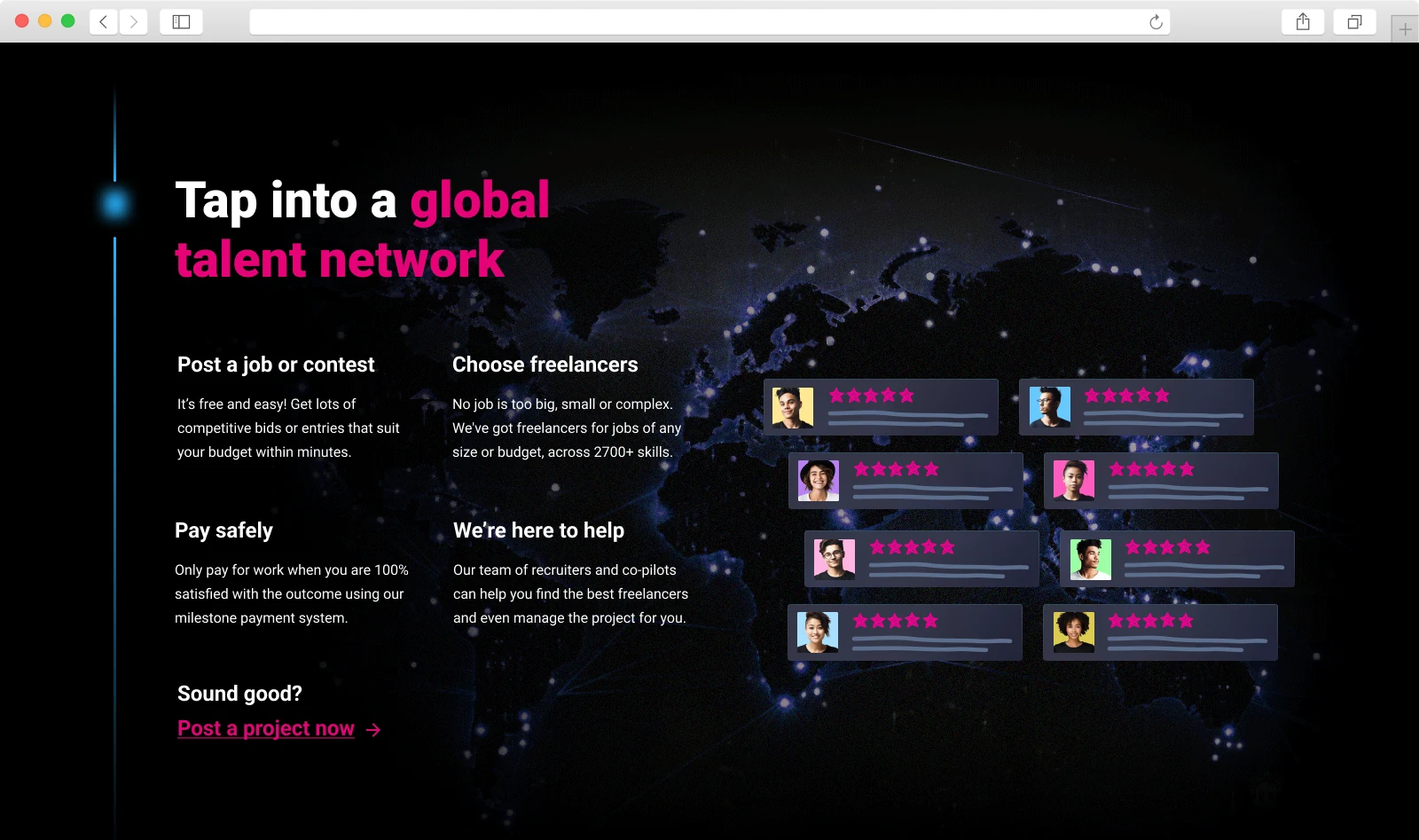
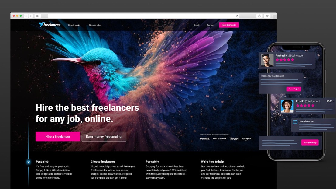
The copy and content were rewritten to tackle one of the old page’s biggest problems: users struggled to quickly understand the core value proposition.
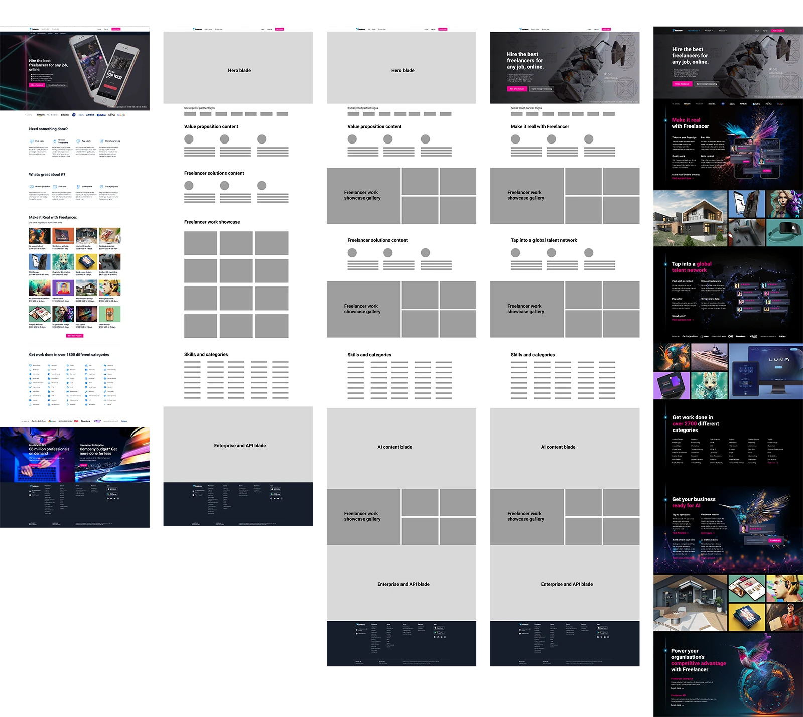
But the most important content on the page is the freelancers’ work.
“One of the key findings from user testing: users wanted to see what they could get from working with freelancers.”
Before
A block at the bottom
A large block of thumbnails near the bottom of the page. Users found it hard to digest all at once, and often scrolled right past.
After
Woven through the page
Freelancer work appears throughout the whole experience, using a more engaging gallery component to show it in its best light.
Mobile
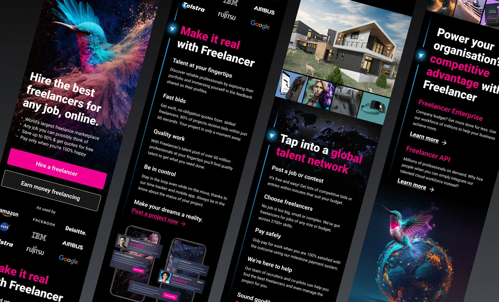
All of this needed a more seamless mobile responsive experience.