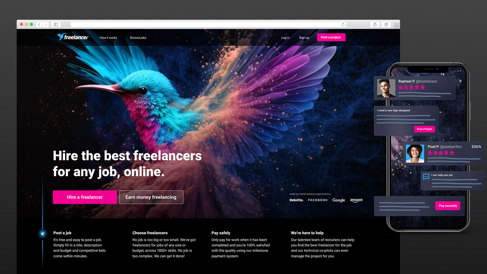
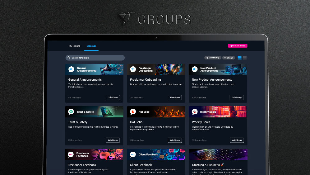
Bits is the design system used at Freelancer.com, containing all of the components and patterns that can be used to craft pages with a consistent user experience using a shared language between design and engineers. Bits is ever evolving as the Freelancer product evolves, and thus requires constant maintenance, improvement and updates.
Components
The overall structure of the Bits design system follows the atomic design methodology. At the core of this are the individual UI components, or Bits as they are often referred to. These basic atomic components are designed to both fulfil their specific purpose of action effectively, whilst also reflecting the Freelancer brand and tone of voice.
Patterns
On their own the individual components serve a specific purpose, but it's once these are put together to create design patterns that the design system starts to take shape. These aid to create consistent and delightful user experiences which should carry throughout the entire website.
Documentation
Since its conception, Bits has always provided a robust component library that engineers can easily grab the components they need for their builds ready to use. But how exactly are these components and patterns meant to be used? In order to evolve Bits into a design system that can be referenced by designers, engineers and product managers alike we must provide guidelines to act as a point of reference for how our patterns work, and why they work this way.
Bits Design System and product
A design system shouldn't be built in isolation, but as a by-product of your product work. Working as a designer contributing to Bits also requires a solid and empathetic understanding of the core product it's serving. Then we can effectively identify where and how Bits needs to improve, whether that be the styling of individual UI components through to more complex UX patterns.
As it stands short term wins revolve around paying off the 'UX debt' the product has accumulated over time, and provide a consistent and seamless experience for users. But beyond that, how can we improve the design system to provide genuine moments of delight for users as they use the product.
Dark mode
One of the more recent developments for the Bits Design System was the introduction of dark mode, which creates the most visually impactful change to not just the design system but the website itself. What initially started as a 'dark mode is cool - we should do it' conversation was presented to our power freelancers who reacted with genuine excitement about it. Aesthetics aside, these users spend a significant amount of time on the site and the darker colour palette was a great relief for their eyes!
Visual revamp - coming soon!
The next steps for Bits will be a visual revamp of the Bits website itself, to give it a more modern look and better reflect the current Freelancer brand, whilst also accounting for dark mode.
Challenges
Genuine passion for a robust design system is something that needs to be adopted throughout the entire organisation, beyond just a select team. So part of evolving Bits to the next level requires championing this passion. For a design system such as Bits to truly succeed it needs to become as system that everyone owns rather than a blocking funnel that teams need to go through to get anything shipped.
The future of Bits
In essence Bits will never ever truly be 'finished'. It was always be evolving as the Freelancer product evolves, and as our users and the way they use the product changes.
For now, the future of Bits can perhaps only be summarised is a few 'how might we' statements:
• HMW improve Bits to become a more sophisticated design system that can be leveraged to pay off 'UX design debt'.
• HMW introduce components and patterns that provide moments of delight for users, making using the product a genuinely enjoyable experience they want to do again.
• HMW effectively scale Bits to keep pace with the product roadmap and evolution.
